UI Design Choices
As a direct relation to the UI, only User use cases will be presented.
Introduction
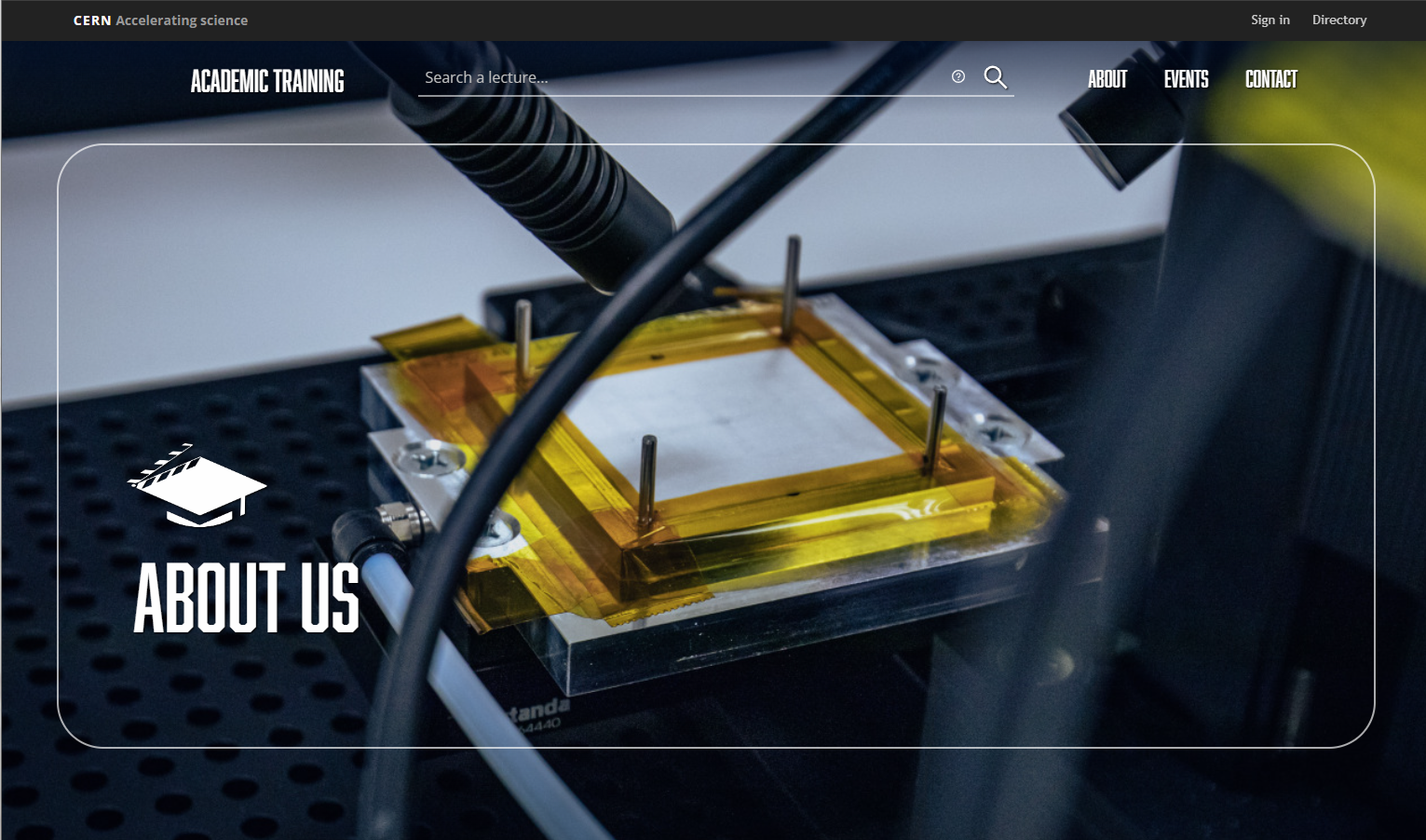
You'll find a carousel with several photos automatically switching vertically once you go to the Main Page of the website. The logo and the photos are specifically made for this project and have been taken around CERN. The photos can be accessed from CDS [Accessed on 15.07.2022].
The same carousel can be found on the About Us page as well.
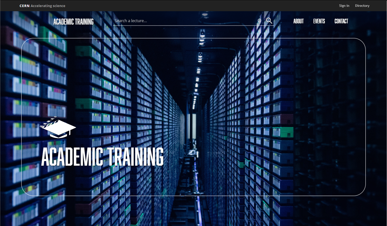
The CERN toolbar and the Academic Training header with the search bar and the menu (About, Events, Contact) are permanently visible, even after scrolling.
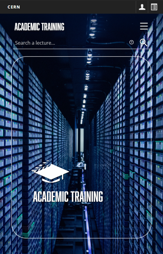
On smaller screens (like mobile, tablet), the CERN toolbar and the Academic Training header take another view. The menu collapses into a hamburger icon and the search bar goes below it and the title.
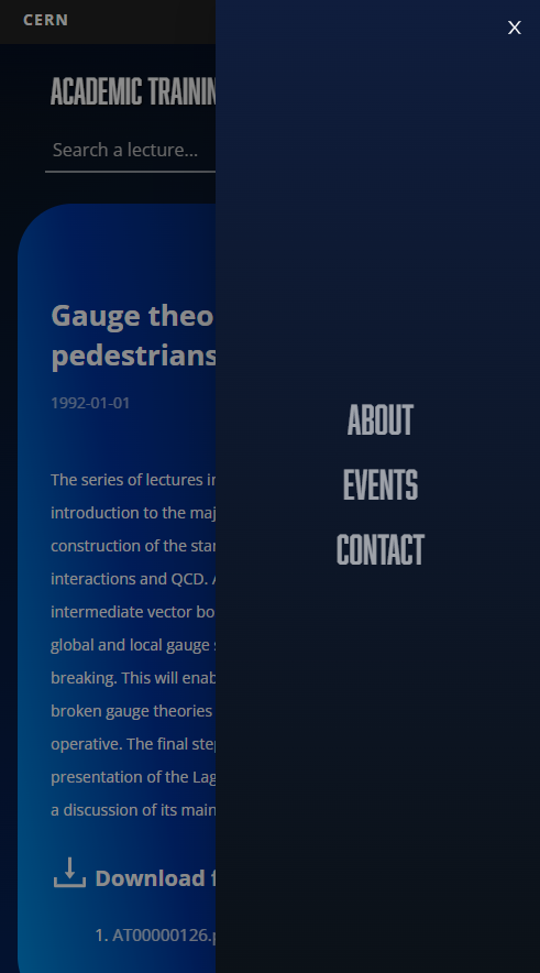
Upon clicking the hamburger icon, the menu will appear in a drawer.
The logo
The Academic Training logo represents an academic hat with the director's cut.

The logo can be accessed from here.
View lecture functionality
As it can be seen, a grid of videos will be displayed chronologically on the Main Page. Each video lecture has the play button, thumbnail, speaker, title, date when it has been released, and the duration of the video.
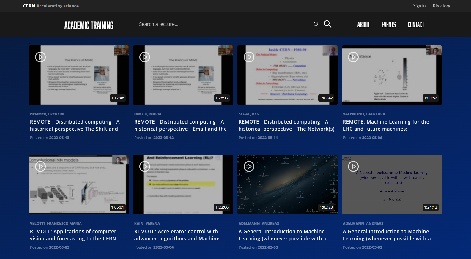
View video lecture
-
Single video
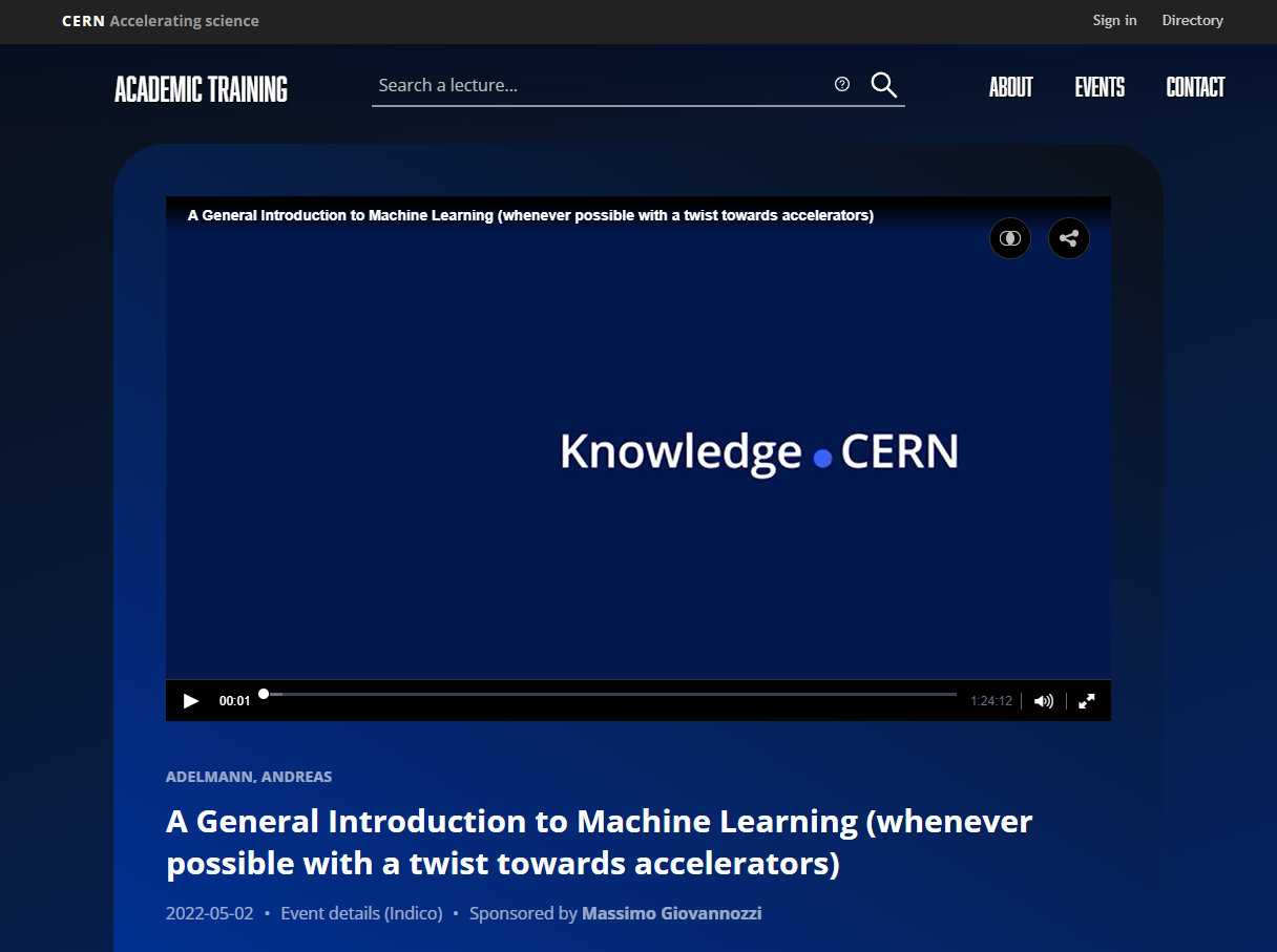
-
Two-channel video
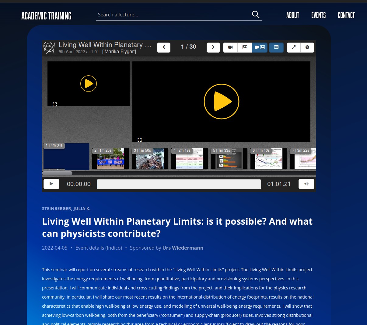
View non-video lecture
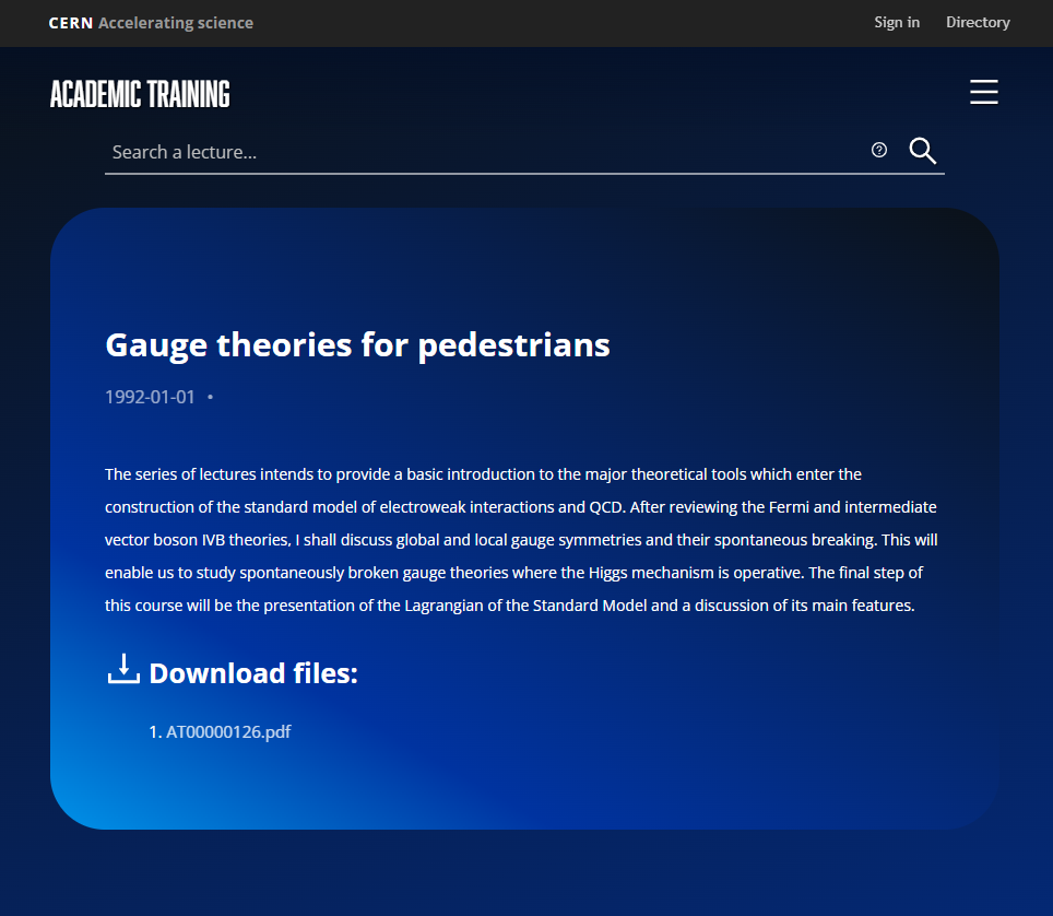
View list of files
Those lectures that have no video content but are available as downloadable files are displayed as follows:
Search lectures functionality
Help for search
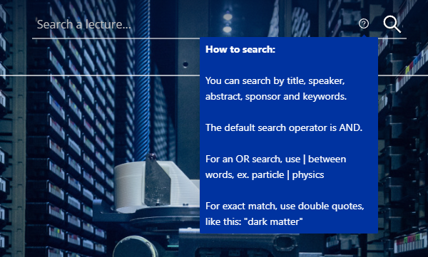
View search results
-
View number of results
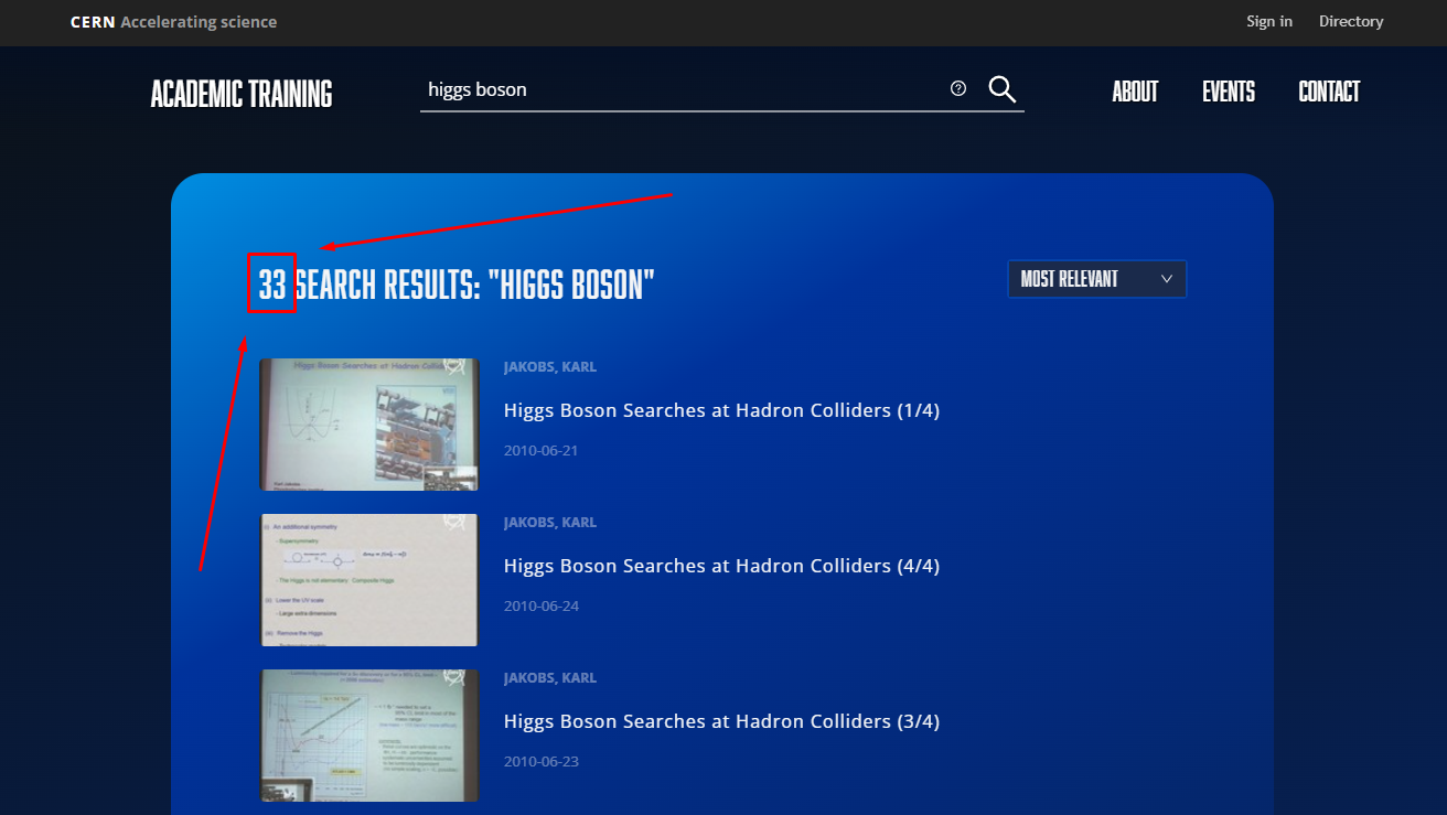
-
Sort results by relevance
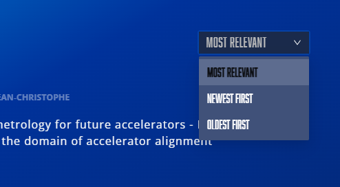
Change search if no results are shown
If there are no results for a searched term, then the following appears:

View ATC members functionality
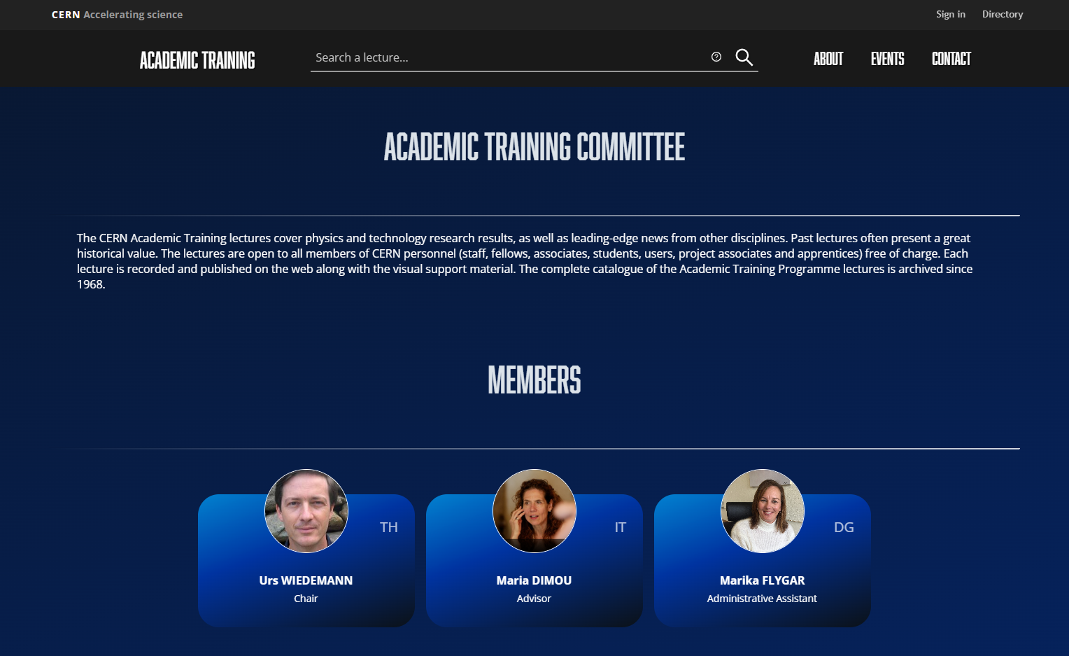
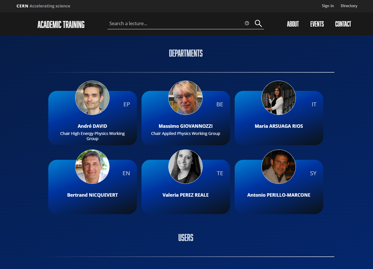
View Events functionality
On the header:

On the footer:
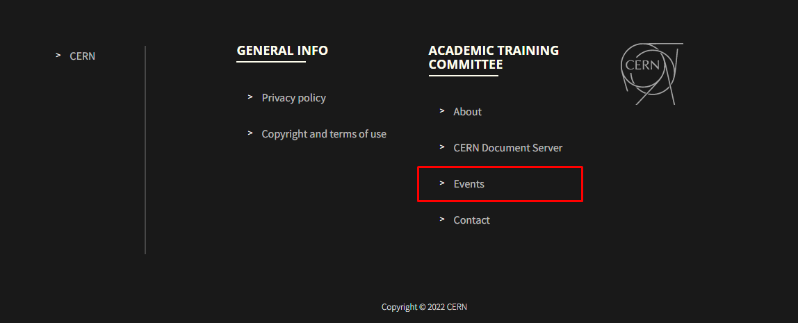
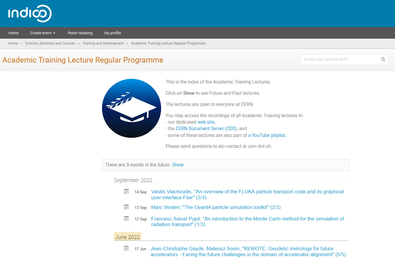
Both of them lead to the Full Programme of the Academic Training series that is available on Indico.
Contact ATC
On the header:

On the footer:
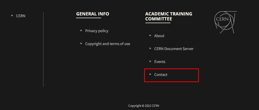
A button that drives users to send suggestions for future lectures also leads to the contact of the ATC.
